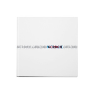
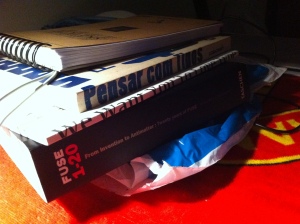
P3 — mapping

The third project was about mapping, we were asked to create a mapping of time, space, motion, journey (spiritual, physical , temporal , etc.) …
I had three initial ideas were :
· Life journey – mapping from the time I was born until the present day
· Physical journey – mapping a trip from Porto to Coimbra
· Pen / tablet – mapping over a drawing of a pen on the tablet
deleted two of them at the outset because, honestly, would not give me much pleasure to run them. Then I got the idea of making a mapping from Porto to Coimbra.
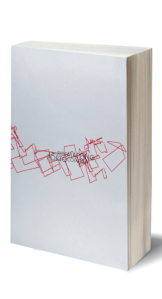
Captura de ecrã 2014-04-29, às 17.09.03
With a cellphone, took a photo every minute until I reach the destination, then, as I wanted it to be an editorial project, with one photo per page, then would have a page of tracing paper on each photo to go with a line of certain points within the photography, which would culminate as in a road from Porto to Coimbra through photographs.
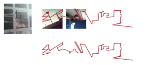
Captura de ecrã 2014-04-29, às 17.07.46
After a brief discussion with the teachers, the conclusion was reached that, the idea was feasible but not this way. Would have a completely arbitrary line without discretion, the photos didn’t make sense, why some were vertical and the other horizontal or oblique.

Truth be told, shivered slightly after the conversation because I did not know where to get back to, it was then that I had two ideas as a backup plan :
· Brain – mapping the brain with all its physical properties and intlectuals
· Type – mapping all my typographic library (with typographical categories , styles , etc.)
But I found most interesting challenge to get back to the physical journey.
Continuing with an editorial project, I gave a twist to the original idea, I went back to make the journey, and with the phone glued to the glass of the train, every minute photo was taken, and what was on the picture that was what was going to be!
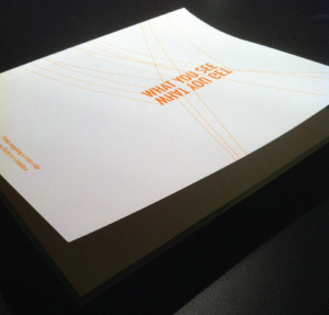
Hence then the title for the book “What you see (is) what you get” emerged.
Captura de ecrã 2014-04-29, às 17.15.10
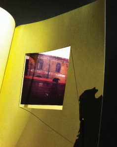
where basically every photo “occupied ” two double pages, the first page (left) have the photo identification (photo number and time it was captured), the next page would have a hole with the map of Portugal (with a line from Porto to Coimbra and this identification was progressing as the book also would) (I see now that was a mistake), the third page of the hole would be cut from the previous page and the last would be the photo.
Captura de ecrã 2014-04-29, às 17.16.26
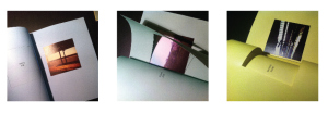
the book was divided into three parts which are represented through the colors of the paper and that represent the stops that the train makes before getting to Coimbra (Gaia , Aveiro). By then I just use the photos and I thought it made no sense to edit them on the computer, therefore, I edited them in my mobile phone.
Captura de ecrã 2014-04-29, às 17.17.29

I think those who walk with the book and do the same trip easily able to be located.

In the end, I think it was a very interesting project, not only forced us to think differently about something we take for granted, but also forced us to find solutions outside the box.
In conclusion, it was a work that gave me pleasure doing it and I am pleased with the final result.

Money

After many mishaps, smoke, sleepless nights, stupid ideas, and forks in the eyes, the ultimate goal of three different approaches to the issue was reached.
also having to spend obviously by ideas that were discarded even though they have been tested:
a collecting approach was put in place, a point of view of a collector, was designed to create a book called “the book of money” where we would have enough notes of various countries, never having all the notes of the same country to order the reader that he could finish the book.
This approach proved impractical because the number of countries and their currencies are endless, and most are not available in an online platform due to government restrictions on the countries themselves.
a metaphorical approach was thought where we would take the phrase “time is money” and would apply it in another platform, then would get an hourglass, the sand removed it and replaced by coins, but the search for an hourglass that was not sealed and able to remove the content has proven to be a waste of time.
One last idea that was not implemented was in a humorist approach, where notes would be printed on paper for wrapping cigarettes and so would be called the “Fat Cat Cigars” but the final result that I got from an experience didn’t pleased me so much, so I ended up abandoning this idea.

Thus, the three ideas / approaches that went on were:

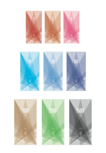
A first symbolic approach, where a new monetary unit was created to Ecuador.
An imaginary briefing was created and from there I start working on the concept.
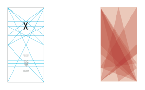
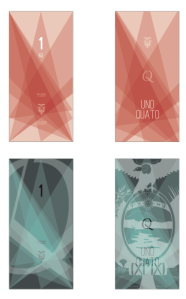
A vertical orientation was given to the new banknotes, a graphic style diamond was done to convey prosperity and strength for a new phase of the Ecuador, as well as to hinder the creation of counterfeit notes, all the “extras” that we normally see in a note were withdrawn, leaving a minimalist abstractionist style, was also added (front and back) two elements visible only under black light to give authenticity to the notes. So apart from the graphics, were left with the monetary number, the sequential code of the note, the authority responsible for printing, the symbol of the new monetary unit (Quato), the shield of Ecuador and the monetary amount in type.

Captura de ecrã 2014-03-2, às 14.44.50

Captura de ecrã 2014-03-2, às 14.44.59 Captura de ecrã 2014-03-2, às 14.45.06

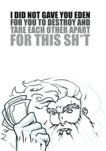
The second approach to the subject was a satirical approach, which basically is the theme in the eyes of God!
An illustration of comic style was created and was left traces of sketch, which is something I personally like it a lot, because I like to see “how it was done” than the final work per say! Adding a sentence of a explanatory nature I found this job finished.

Captura de ecrã 2014-03-2, às 14.45.49

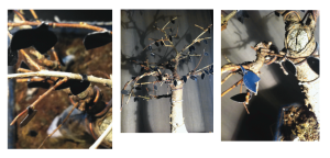
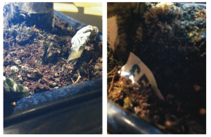
The last approach was an allegorical approach, where I picked the phrase “money is the root of all evil” and transcribed this phrase to a different format (sculpture), despite my initial idea that was picking a tree, pluck it out and cover the roots with printed money and leaves with typography, I concluded (fast) that I had no means to do so, would take me a long time and could not afford transportation to a tree, then decided to apply to a bonsai, took off all the leaves and pasted new black ones (printed) each with evil things written (rape, murder, lying, etc.), I also discovered that the roots of a bonsai are not very proper to be involved with paper, then let the bonsai standing and made of new ones (from printed notes) and displayed the roots breaking out across the soil.

Captura de ecrã 2014-03-2, às 14.45.25Captura de ecrã 2014-03-2, às 14.45.33

Looking back and being honest, it was not a work that has given me much enjoyment doing and maybe that translates into the final work itself because I believe to accomplish a good work we need to like what we are doing, even though sometimes necessary to make what we do not like (which was the case for me), there are those works that we’re barely reading the briefing and we already have a thousand of ideas of what we want to do … and this work was a blank space in my head for a few weeks, but I’m not unhappy because there is always something no matter how small it is, in the future we will take the necessary value of it!

money

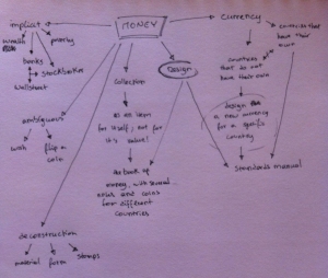
The symbolic approach of the subject is an object that represents, stands for, or suggests an idea, belief, action, or material entity,and from a a designers perspective it makes perfect sense a standards manual of a new currency for a country that actually do not have their own. Why not a “rebranding” of an already existing one? Well, it’s more appealing to build an all new object from the ground up, even tho it’s for an academic project, I would like to think that my work could actually been use “for the country that I would work on with”. I can make an all new arrangement from type to graphics without “hurting” a percentage of a population that is used to use a certain monetary unit that’s related to their homeland (like the dollar for the U.S.A). So, in case of my chosen country really decided to start printing their own bills I can give them the suggestion of an idea or an entity, a piece of their history by the form of money!

An allegorical approach to the subject is a literary object in which characters or events in a literary, visual, or musical art form represent ideas and concepts, they are taken literally to a new support. So, let’s take the saying “Money is the root of all evil” and try to represent it literally, and like from some Mahori tribe in New Zealand point a view why not create a sculpture of it? I just need to know how far I can go, I mean, I would not certainly overthrow a tree to accomplish such idea, but the bigger it gets the more impact will create! So, getting a relatively large and light tree or else is something that must be taken in consideration, it is crucial that the main object should be natural, not a look-a-like artificial piece, since im wrapping the roots with money and make black leafs with evil things written on them, I think that the natural element will give the final piece some veracity.
This way then, I can have an allegorical piece of the subject!

A metaphoric approach would be a comparison of two things that are normally unrelated, and from an entrepreneur point of view what’s make more sense (subject related) than “time is money”? An hourglass would be used for this idea, but instead of sand it would be filled with coins (1, 2 and 5 cents of an Euro), like the allegorical approach we would end up with an object, even tho artificial (created by Man), the natural interpretation for this piece would be twisted by  the content of the same.


A scope approach is the gathering, assessing or investigate something, and from a collector’s point of view the idea of making a book about money is the idea that strikes! Making a book of several different coins/bills from all around the world, obviously that would only be the image of those same coins/bills, because getting the real thing would take a lot of time and specially a lot of money, and the idea is that the book isn’t finish, with coins and bills missing, because if it was finished wouldn’t be an item of collection (the content of the book) but it would be an inventory!
So, this way we would have a collector’s book of money entitled “The Book of Money”, not giving it an historical approach but of an hobby.

ONPOK

onpok_newlogo

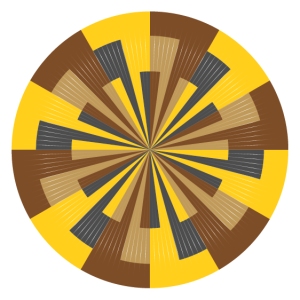
ONPOK is a brand of handmade one pointer clocks.
ONPOK arises from the first project of the M.A.,
at the early beginning the professors gave us a briefing and it was told that we (students)
will be opening a shop at down town Porto, a pop-up shop to be more precise!
Each one of us had to come up with an object (from scratch or take one object and rethinking it) and use our craft to sell it or acquaint people of it.
After 30000 sh*tty ideas, the idea of one pointer clock comes to me like
a “just for fun” idea.

But after a talk with both of the professors they asked me “why not?” and they pushed this idea forward. So I started to work on it… and my early sketches sucked!! earlysketchonpok

They where so confusing or so jejune that I had to come with so more simple, effective and interesting way of presenting it, so I kept working and after a few more failed attempts I finally got to the final design

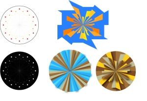
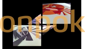
final_onpok

at this point I had my layout right where I wanted, but what about the 3D that I wanted to incorporate in it? I didn’t want to create just a one pointer clock with a flat surface, I wanted to give my clocks a touch of something…
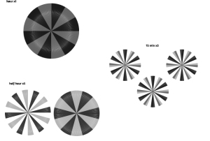
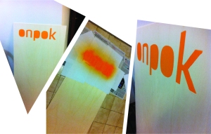
So I decided to print the clocks by parts, the hours will be in a flat surface, the half hours and the quarter of an hour will be printed separately,

decomposeonpok

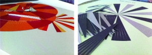
in a high grammage and texturized paper I printed several of them (just in case of anything went wrong… and it did!). Now comes the hard part, CUT!!!
I am no good when it comes to manual work… like cutting!
But the work needs to be done so I sliced every one of them like a f*cking samurai (apprentice samurai).

cutonpok

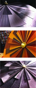
after the collage and assembling them together I noticed that with the right light we can get some pretty cool effects with ONPOK clocks

rightlightOnpok

Now I needed to build a box for them, but I discovered that the printing in the boxes, plus the making of the boxes exceeded my budget! So I needed to find some other way to do it!
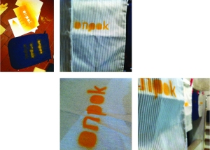
And I thought, why not bags? Like diaper bags, and since my clocks are handmade, it make perfect sense that the bags were too, so I went to a tailor store at downtown Coimbra and I bought some… now I only had to do something with these bags so people would know that they are ONPOK bags!

onpokbags

My first experiments did not work that great but at the end I had the work done and the idea of handmade products that I wanted to pass is visible!
Finally I only had to construct the exhibitor for the clocks, so starting from the same principle I did the same that I did with the bags

onpoktabua

beside creating a brand, I created a product, I left my comfort zone and did something handmade, it took a lot of time and work and nights in blank but it was worth it I guess, would I repeat this experience? Absolutely… not!
Don’t get me wrong, I really loved doing something like this and it is an asset to me but I really hate manual works where I need to grab glue or a scissor.
I hope you enjoy the result as much as I do, I will post some more photos and a logo explanation soon!